AI-powered platform for food R&D and sensory testing
A comprehensive SaaS solution enabling food R&D teams to plan, execute, and analyze sensory experiments.
The platform connects researchers and testers through an intuitive workflow, providing AI-driven insights, faster iteration, and real-time experiment management.
FoodTech / SaaS
Product Design
AI / Research Platform
Services
Product Design — UX Research, Strategy & Interface Design
Category
SaaS Case Study / FoodTech Platform
Client
A.K.A FOODS
Scope
MVP Design & Development
Frame work
Double Diamond + Lean UX
Duration
8 months
Focus
Efficiency, clarity, and cross-team collaboration

Design Approach & Objectives
Overview
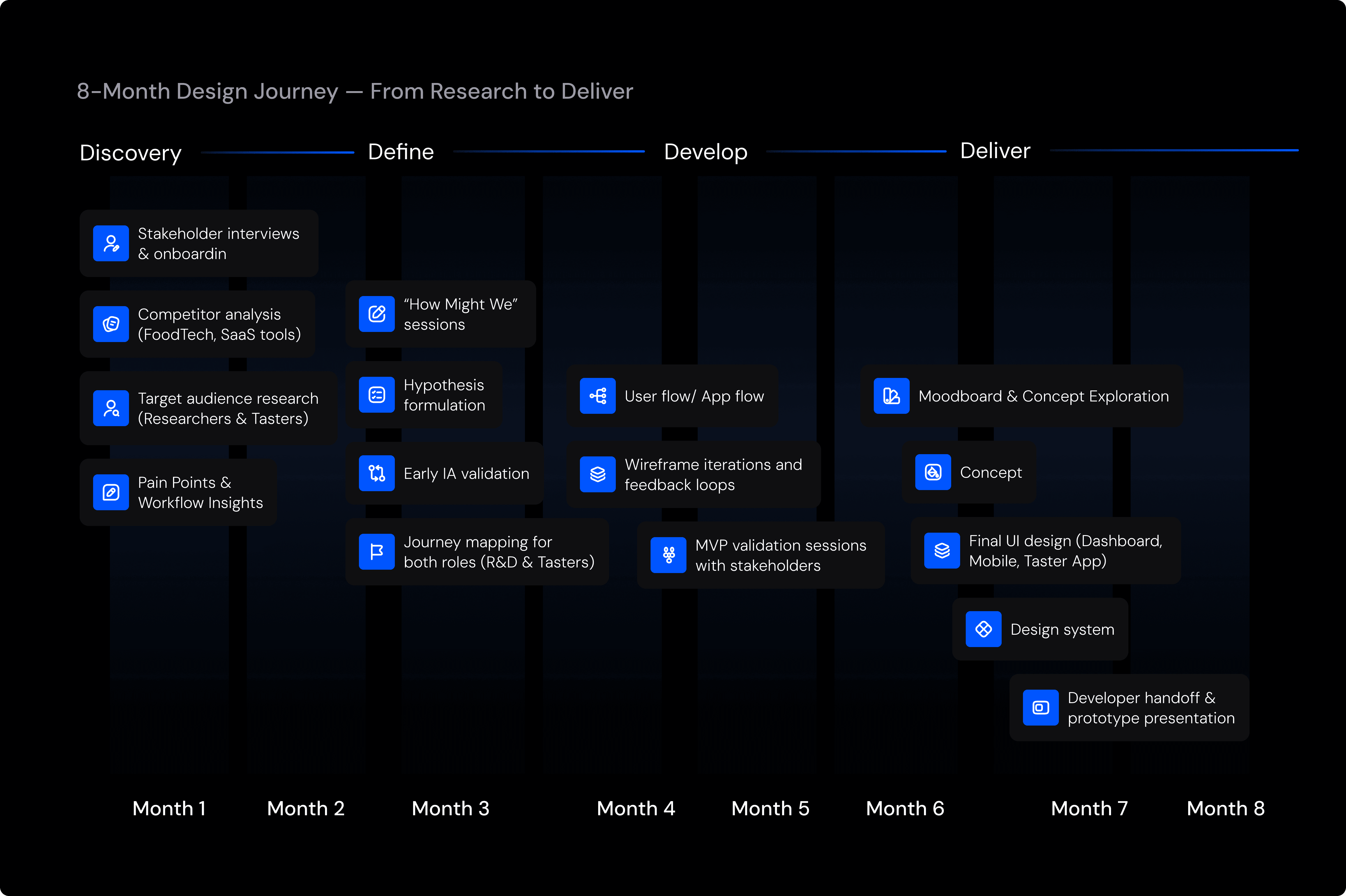
The project followed a structured, research-driven process to align business goals, user needs, and development priorities. Guided by the Double Diamond and Lean UX frameworks,the eight-month design journey emphasized rapid validation, measurable outcomes, and continuous collaboration with R&D teams, ensuring every design decision was both data-informed and stakeholder-approved
Process Phases
The design journey followed a clear, iterative pattern across four main stages — ensuring a balance between discovery, ideation, and delivery.
The design process unfolded through four iterative stages — maintaining balance between exploration, validation, and delivery.


Each stage involved collaboration with R&D stakeholders to ensure user alignment and technical feasibility
Business Objectives
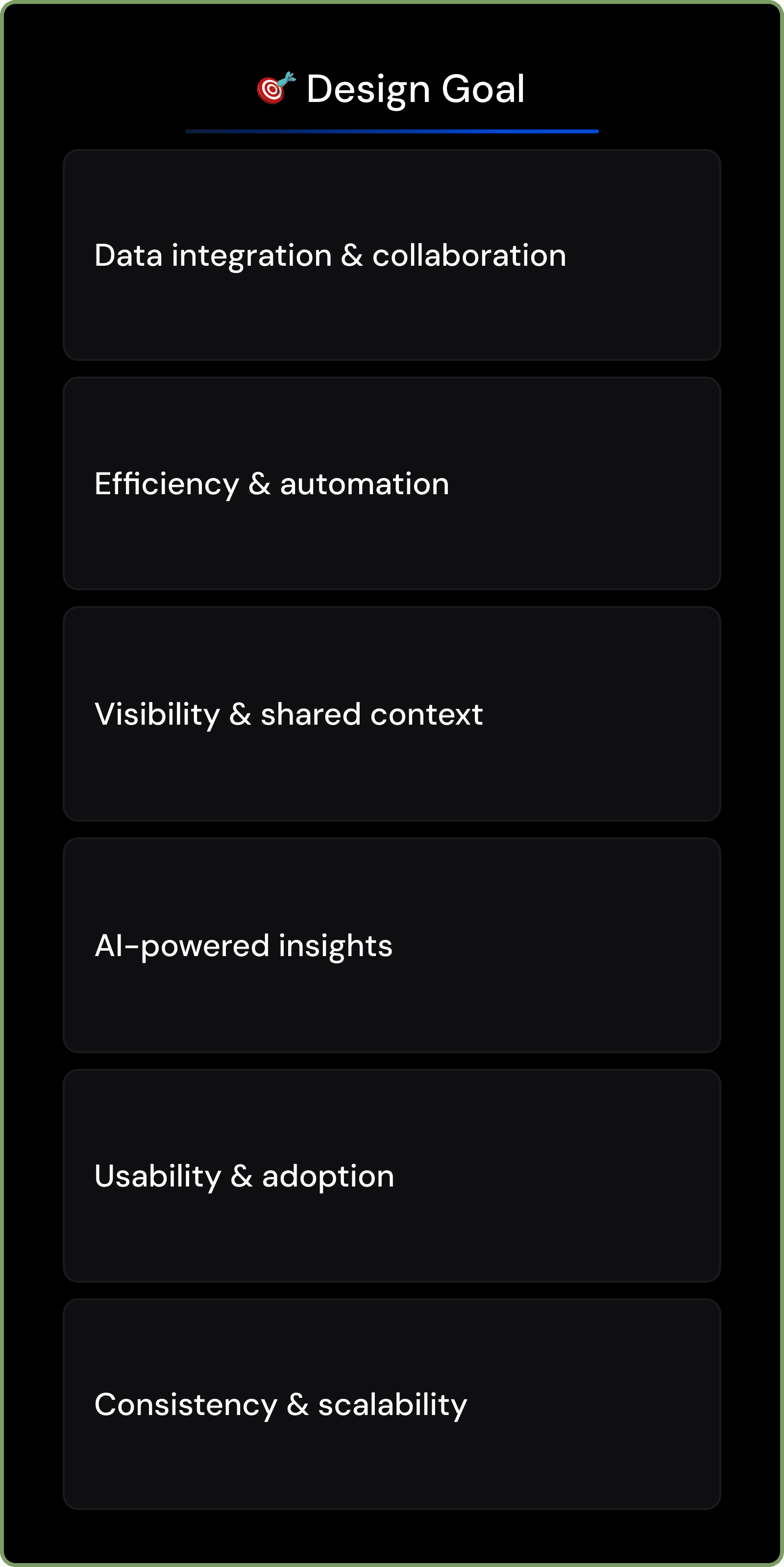
The goal was to design an intelligent FoodTech platform that simplifies sensory research and unites R&D teams and testers within a single digital ecosystem.
The solution needed to reduce setup time, improve data accuracy, and enable seamless collaboration across roles — from food technologists to sensory evaluators.
These objectives served as measurable design criteria throughout the MVP cycle
Key Objectives
Streamline experiment planning and analysis
Improve coordination between technologists and testers
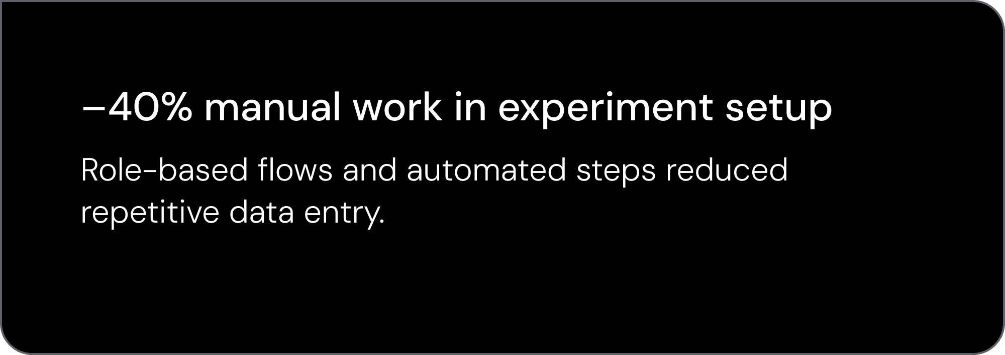
Reduce manual data entry through automation
Establish a scalable design system for future product growth
Each phase was reviewed with stakeholders to ensure consistent alignment between design decisions and business objectives.
Validation & Outcome
Validation occurred continuously — not as a separate phase.
Stakeholders, developers, and real Xpence users provided feedback throughout each iteration.
Each step — from IA to wireframes to high-fidelity UI — was tested against real product constraints and user behaviour.
This ensured that the new web platform and updated mobile flows were:
clear, with intuitive navigation
consistent, with unified iconography and component logic
scalable, ready for future features
usable, reducing confusion and support incidents
This collaborative, iterative approach helped deliver a platform that was user-tested, aligned with business needs, and technically feasible from day one.
Discovery — Research & Context
Overview
The Discovery phase established a deep understanding of the FoodTech domain, user behavior, and the gaps in current R&D workflows.
Through stakeholder collaboration and early field research, we uncovered the core challenges limiting efficiency and cross-role communication — insights that guided every subsequent design decision.
Aligning Product Vision & Success Metrics
To ensure a unified direction, I facilitated stakeholder workshops to clarify business goals, technical constraints, and desired MVP outcomes.
These sessions allowed us to define measurable success criteria and align on priorities for both technologists and sensory testers
Focus Outcomes:
Clear MVP scope and success metrics
Shared understanding of data accuracy and collaboration goals
Early alignment between business strategy and design direction
Framing the core design focus by connecting business goals to real user challenges

Competitor Landscape
We analyzed multiple FoodTech and SaaS solutions to understand how existing tools handle experiment tracking, data visualization, and team communication.
This analysis helped identify usability gaps and opportunities for differentiation.
Key Insights:
Existing platforms were overly complex and data-heavy
Few tools supported collaboration between testers and technologists
Limited use of AI for automation or experiment optimization


Competitor analysis highlighted gaps in collaboration and workflow integration.
Understanding Users
To build a user-centered foundation, we developed detailed personas representing the key roles in the platform — technologists, sensory experts, and managers.
Each persona reflected specific goals, daily workflows, and technology needs.
Research Activities
Desk research on R&D lab workflows
Interviews with domain experts
Empathy mapping and journey definition
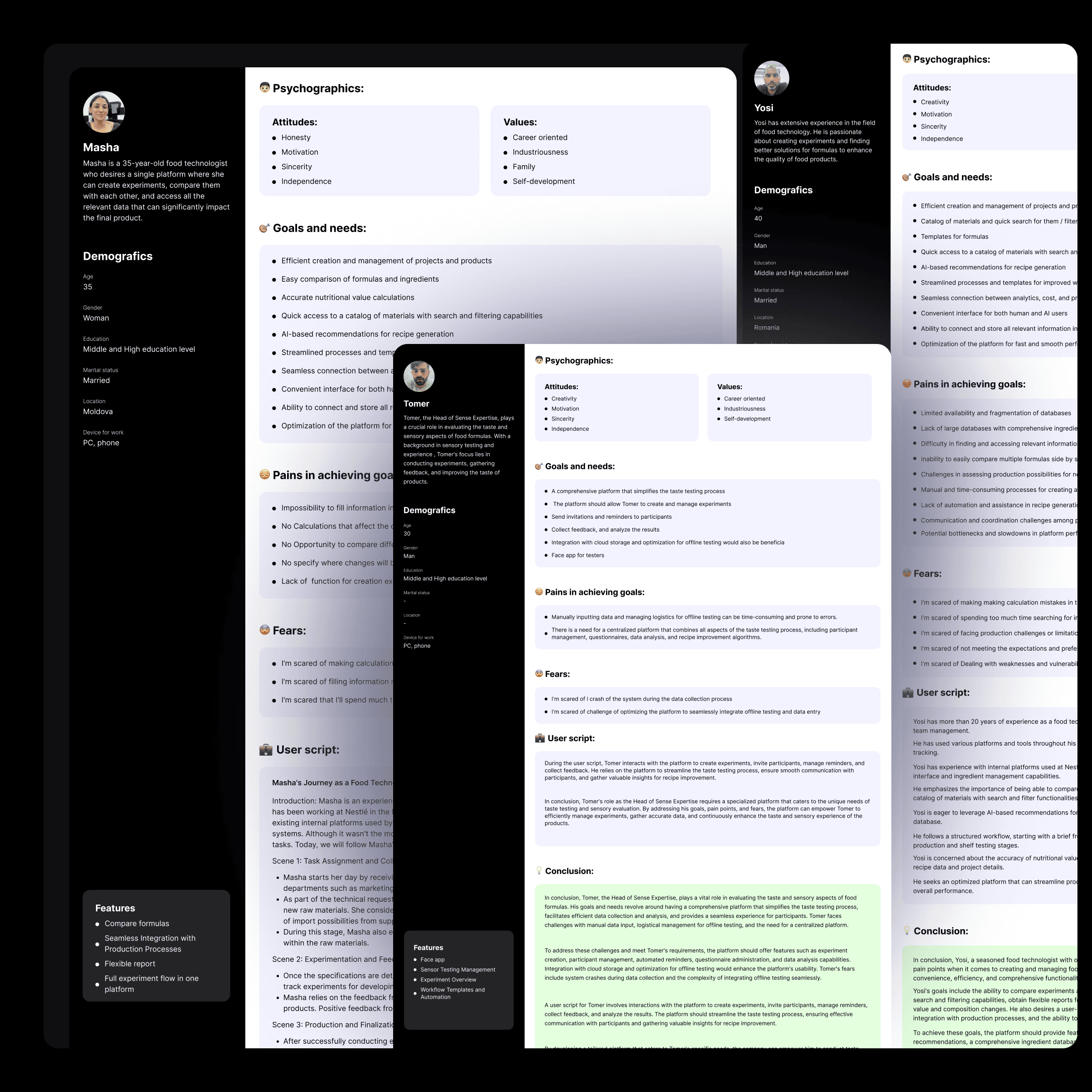

Personas captured distinct needs and workflows for both human and AI-supported users.
Key Findings & Design Opportunities
By synthesizing findings from stakeholder interviews, competitor research, and persona analysis, we uncovered recurring friction points across roles.
These insights revealed both operational inefficiencies and emotional barriers affecting collaboration in food R&D workflows.
They guided the strategic focus for the next design phase — defining hypotheses and information architecture.
Key Insights
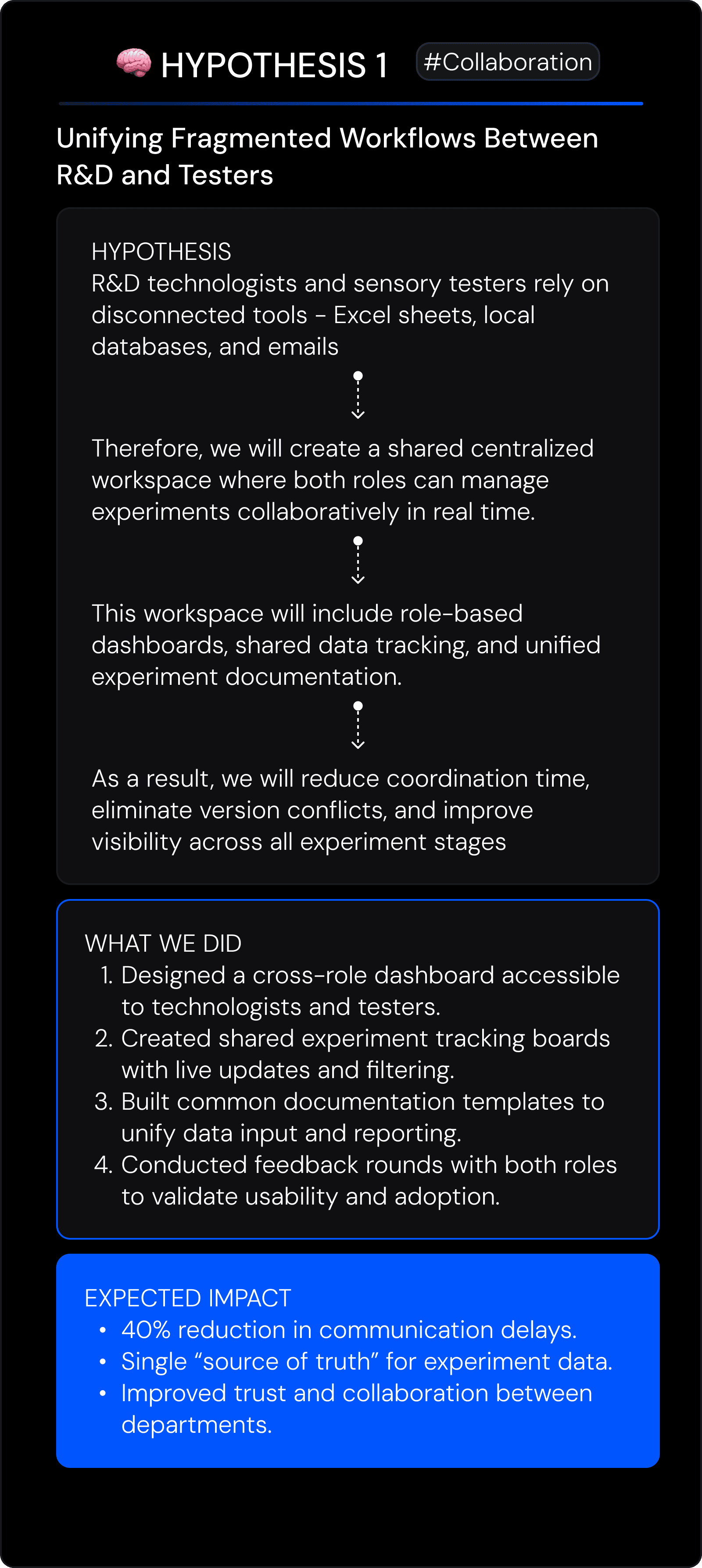
1. Fragmented workflows cause data loss
Technologists and testers use multiple tools (Excel, local databases, emails), leading to version mismatches and incomplete experiment records.
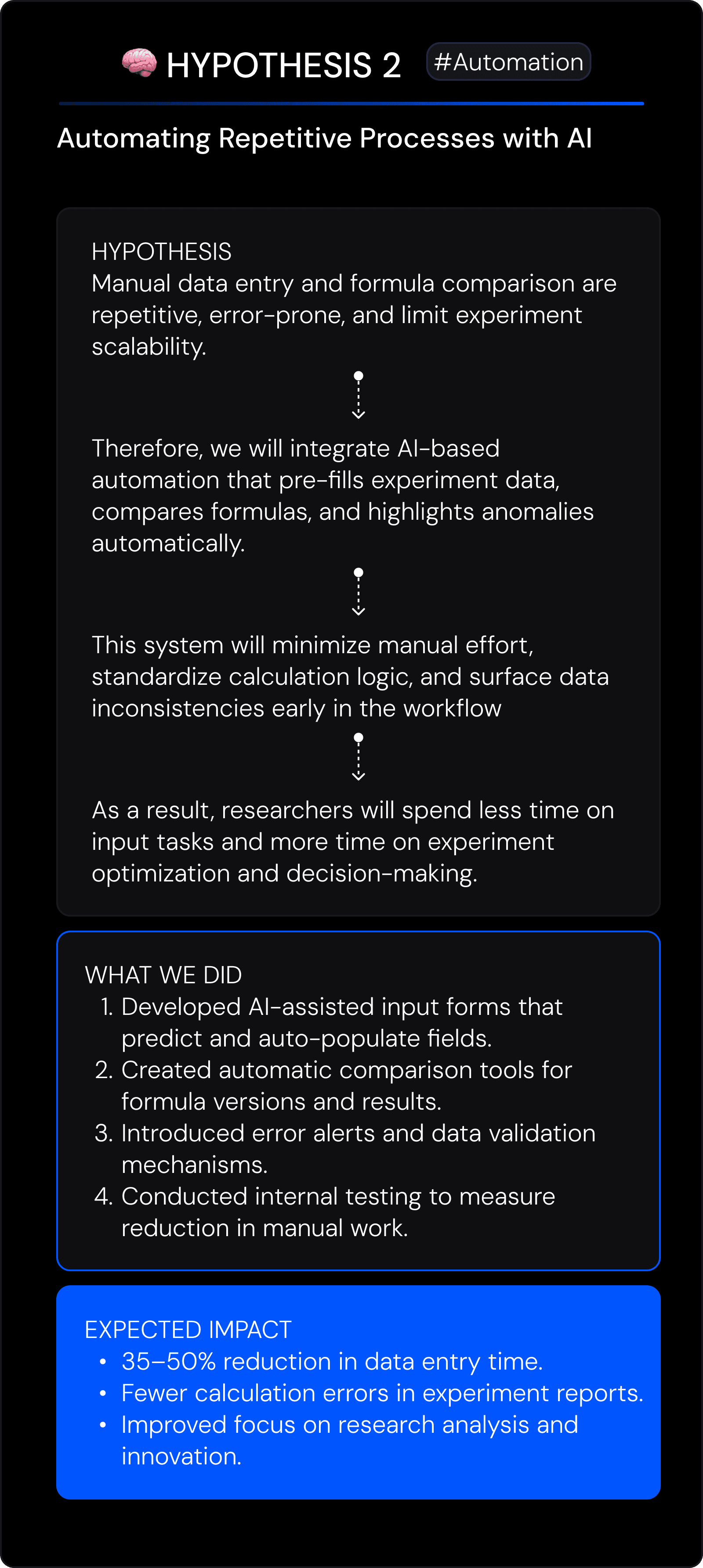
2. Manual input reduces efficiency and accuracy
Repetitive manual data entry across systems causes frustration and calculation errors — a major concern for technologists like Masha.
3. Lack of transparency between R&D roles
Researchers can’t easily monitor tester progress or sensory data — resulting in delays and unclear accountability.
4. No AI-driven decision support
Experts see potential for automation (ingredient suggestions, formula comparison), but existing tools lack intelligent recommendations.
5. Psychological barriers to adoption
Users fear data loss, system crashes, or complex interfaces that might slow their workflow — especially testers with limited tech exposure.
Design Opportunities
Opportunity 1 — Centralized workspace
Create one platform uniting all FoodTech roles with shared experiment tracking, reports, and data visualization.
Opportunity 2 — Intelligent automation
Leverage AI for generating recommendations, comparing formulas, and automating repetitive input tasks.
Opportunity 3 — Streamlined collaboration
Enable synchronized workflows between technologists and testers — with transparent experiment status and feedback loops.
Opportunity 4 — Role-specific experiences
Design differentiated interfaces for Technologists (data-heavy) and Testers (light, task-based) while maintaining consistent logic.
Opportunity 5 — Reliability & trust through UI clarity
Focus on a clean, predictable interface that minimizes cognitive load and builds confidence in system accuracy.
Design Opportunity
Insight
Manual data entry →
Automation via AI
Lack of transparency →
Shared dashboard views
User fear of complexity →
Simple, trust-building UI
Synthesized insights translated directly into strategic design opportunities for MVP development.
Define — From Insights to Action
After identifying core inefficiencies in FoodTech R&D workflows, the next step was to translate research findings into actionable design hypotheses. Using the PIS Framework (Problem → Insight → Solution), I structured complex challenges into measurable opportunities that defined the MVP scope and guided information architecture decisions.
Framework Used:
PIS Framework + How Might We (HMW)
Each problem was translated into an actionable insight and validated through iterative stakeholder reviews.
PIS Framework


How Might We — Translating Insights into Design Questions
Each question was derived from a validated insight in the PIS Framework, transforming research findings into opportunities for design exploration.


Each “How Might We” question originated from validated insights, guiding ideation and informing hypothesis testing in the next phase.
Hypotheses — Turning Questions into Measurable Assumptions
Each “How Might We” question was translated into a testable hypothesis — aligning design ideas with measurable outcomes.
These hypotheses guided MVP scope decisions and validation priorities, ensuring that each feature addressed a verified user or business need.

Each hypothesis was validated through early prototype reviews with R&D experts and testers, allowing the team to prioritize features that demonstrated the highest potential for user and business impact.
By framing hypotheses early, the design team established clear success criteria for the MVP.
This ensured that future design iterations were guided by real validation — not assumptions
Hero Hypotheses — From Assumptions to Validated Design Directions Each “How Might We” question was refined into a testable hypothesis and validated through feedba
Each “How Might We” question was translated into a testable design hypothesis, then validated through iterative feedback with R&D experts and sensory testers.
These validations guided MVP scope, prioritized high-impact features, and ensured every design decision was grounded in measurable outcomes.

Develop — From Functionality to Flows
During the Develop phase, the focus shifted from defining hypotheses to creating the first tangible version of the product experience.
Every interaction, flow, and functionality was mapped, tested, and refined — ensuring that both R&D technologists and sensory testers could perform their tasks efficiently and intuitively.
This stage translated strategic insights into actionable UX architecture and validated prototypes.
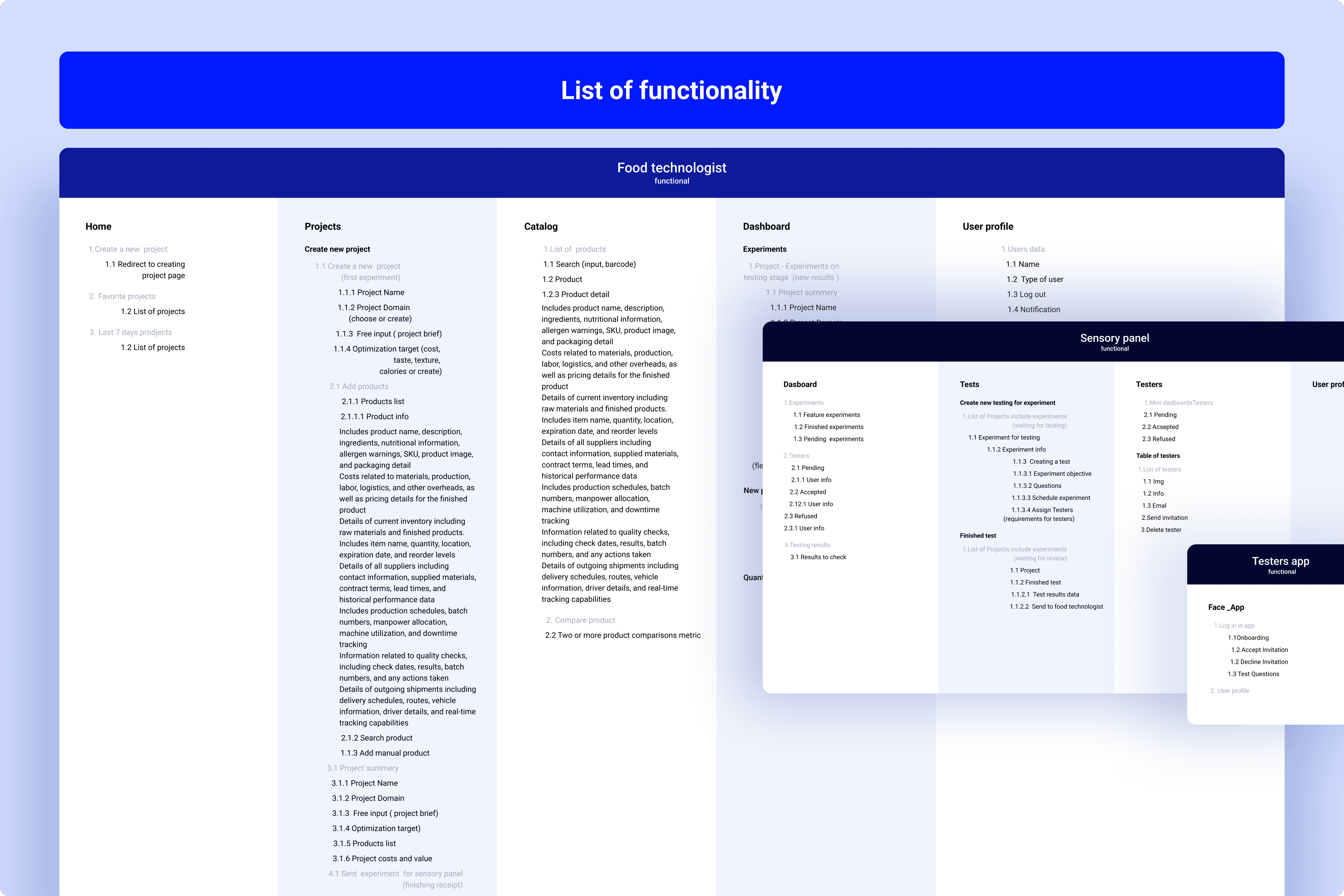
Information Architecture & User Flow
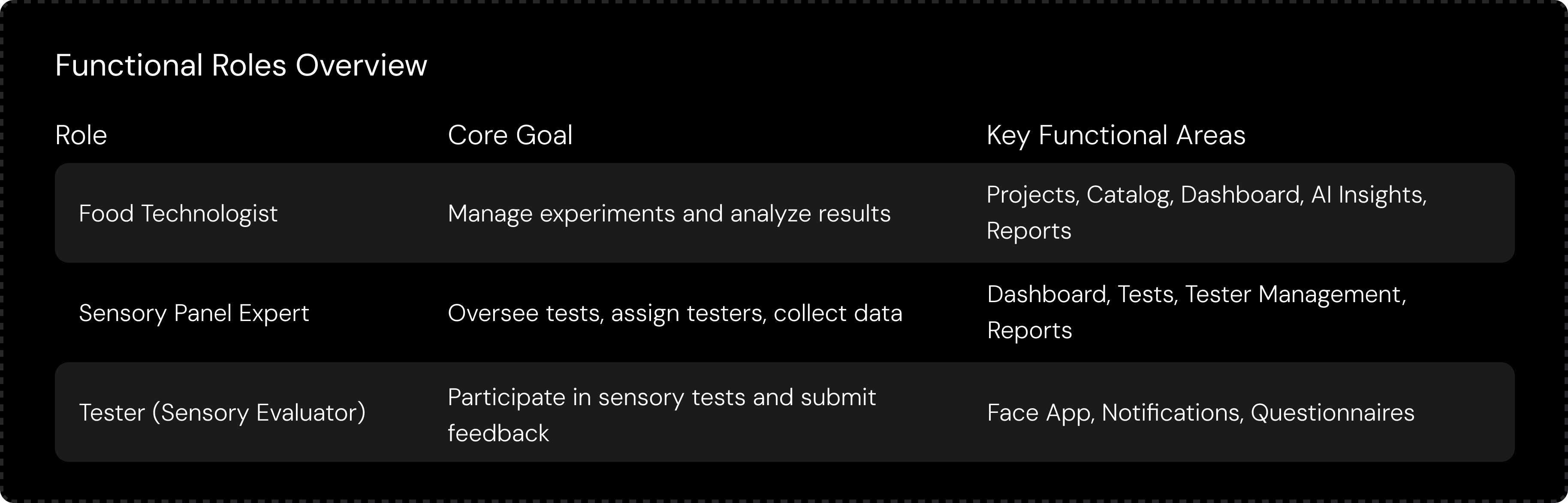
Before designing screens, I structured the entire system logic — mapping functional areas to user roles to ensure clarity, scalability, and collaboration across FoodTech teams.
Each functionality was prioritized based on validated hypotheses, aligning with both business and user objectives.
This mapping became the foundation for user flows, application architecture, and later — the UI system.
Key Functional Areas:
Experiment Creation: Setup templates for formulas, variables, and sample sets.
Testing Management: Track tester participation and collect sensory data in real time.
AI-Assisted Insights: Auto-generate comparisons, detect anomalies, and suggest improvements.
Data Visualization: Provide intuitive dashboards for tracking experiments and results.
Reporting & Collaboration: Export structured summaries and share findings across teams.
With a validated application flow, the next step was to define structure and interaction patterns through wireframes.
The final app flow (v.03) delivered:
A clear hierarchy and role-based experience for all user types.
Streamlined task flows — reducing redundant steps and improving clarity.
Improved consistency between modules, enabling faster onboarding and smoother collaboration.
A validated foundation for wireframing and interaction design.

Translating Flows Into Usable Layouts
Using the refined application flows, I created low- and mid-fidelity wireframes to validate navigation logic, test complexity early, and define core interactions. This ensured both R&D technologists and sensory testers could complete tasks quickly and confidently.
Process
Task → Interface Mapping: Converted each major user goal into screens and modules.
Role-Based Layouts: Designed dedicated flows for Food Technologists, Sensory Panel Experts, and Testers.
Iterative Wireframing: Started with sketches, moved to mid-fidelity layouts, and refined based on stakeholder feedback.
Interaction Design: Defined guided steps, inline validation, dashboards, and confirmation states.
Outcome
Validated end-to-end structure
Simplified workflows across all roles
Clear, reusable navigation pattern
Solid foundation for UI design and the design system


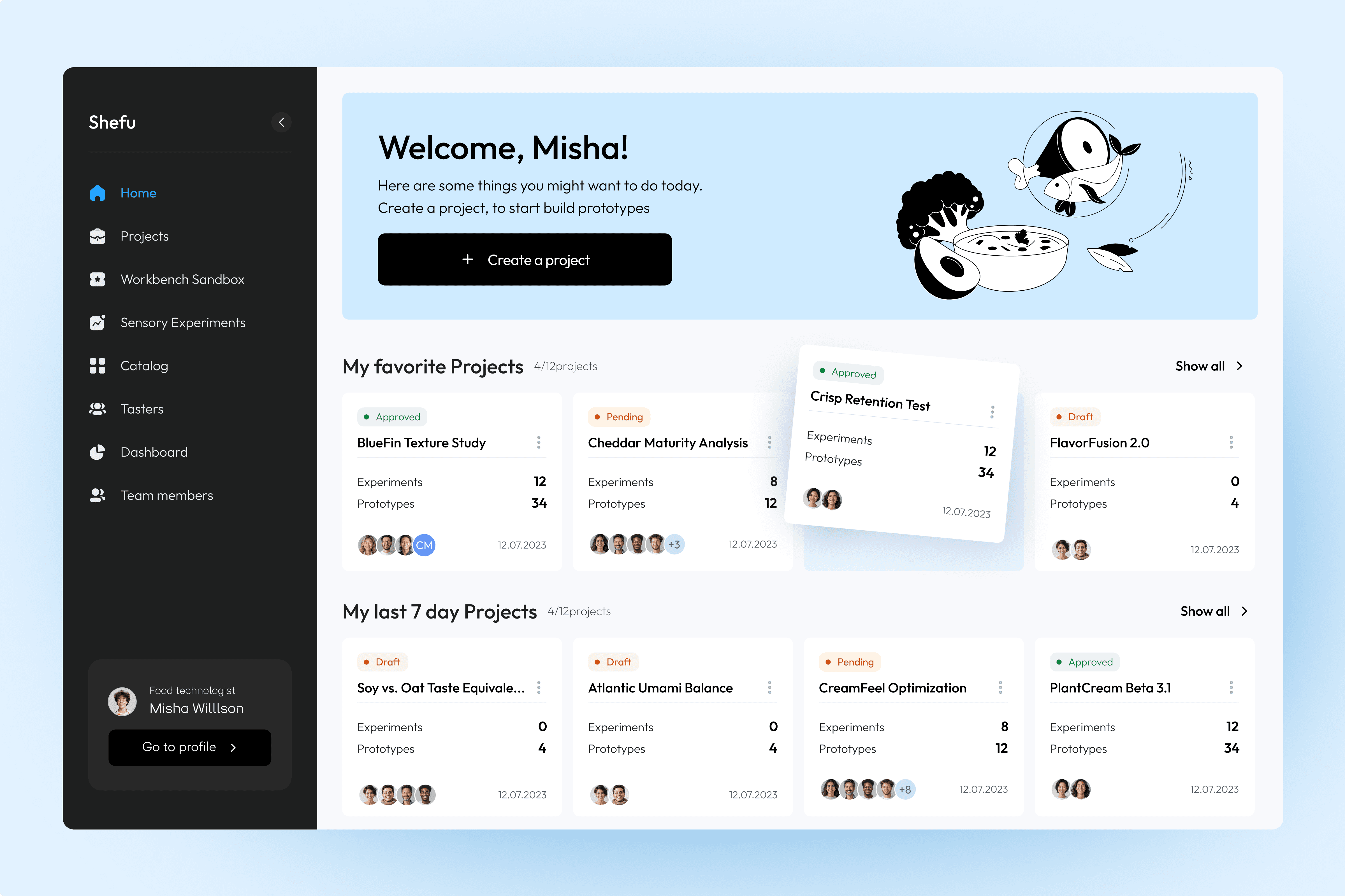
Deliver — From Concepts to Final Product
During the Delivery phase, the focus shifted from structure to visual clarity, craft, and consistency.
I explored multiple UI directions, built a scalable design system, and delivered final high-fidelity designs for the dashboard, mobile screens, and tester app — ensuring the product was cohesive, accessible, and production-ready.
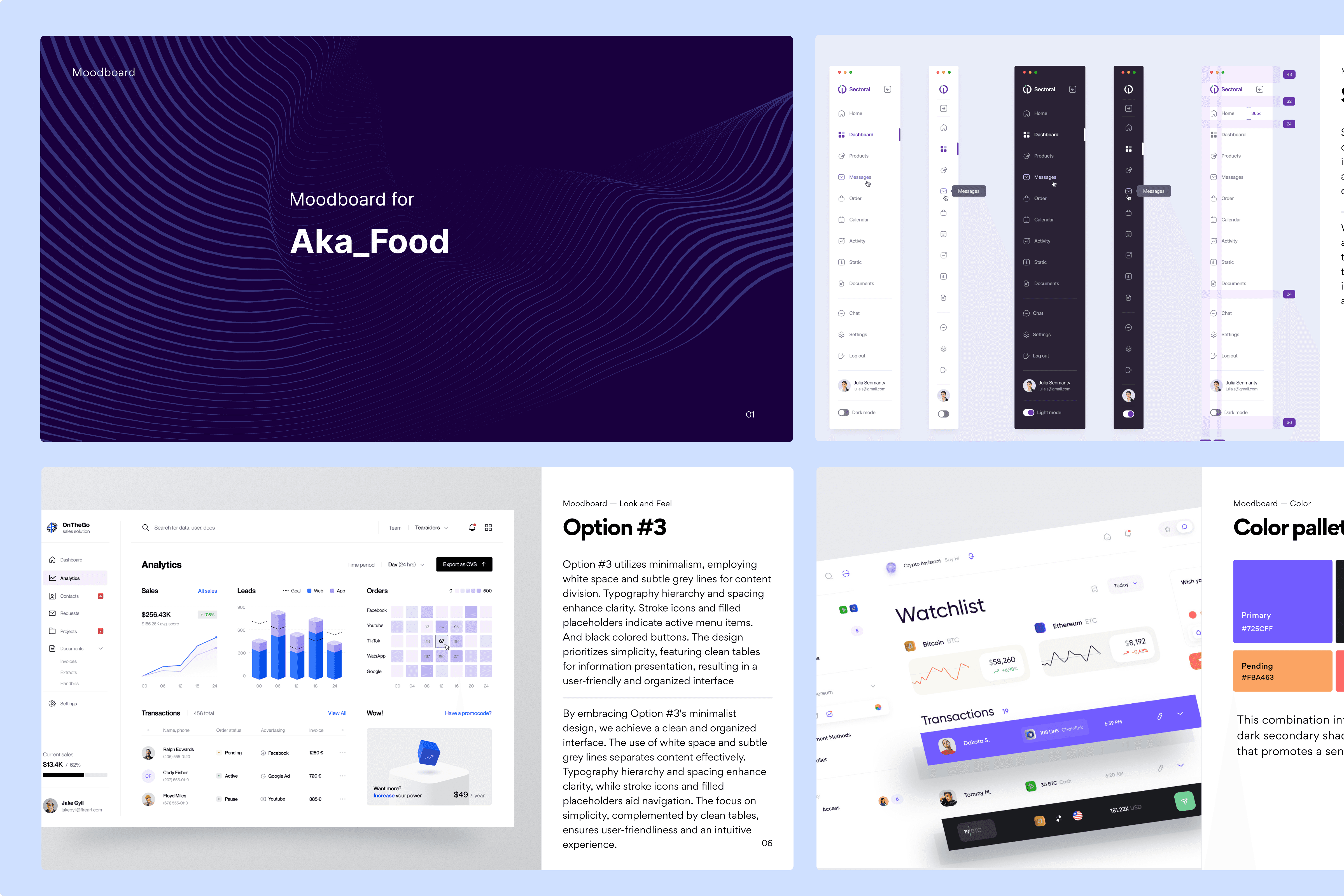
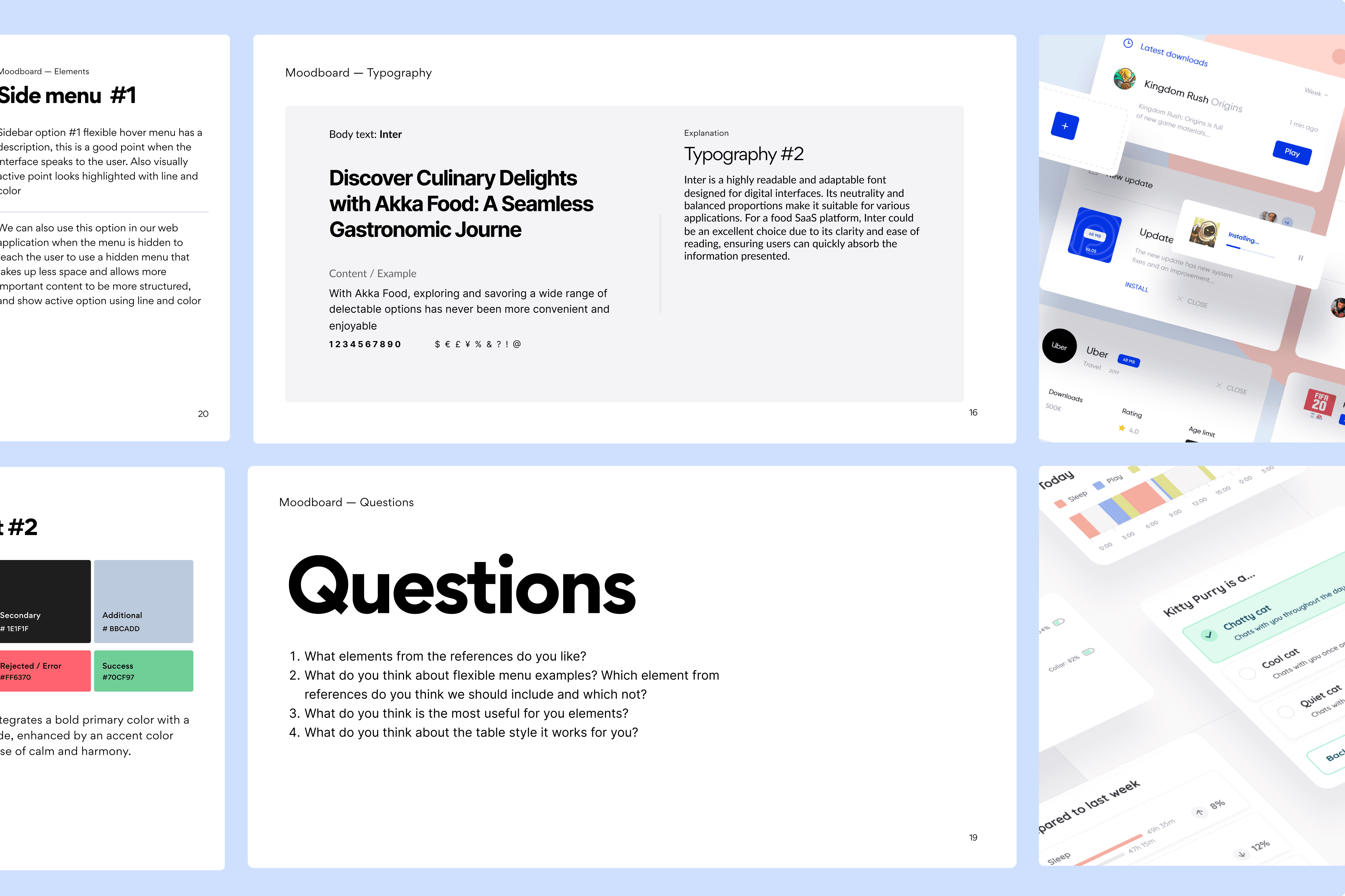
Moodboard & Visual Direction
To establish the product’s visual language, I explored multiple directions inspired by scientific interfaces — balancing clarity,
hierarchy, and approachability.
Focus Areas:
Clean scientific look: neutral palette, precise spacing
Strong hierarchy for dense analytical data
Modern geometric typography for clarity
Warm accents for non-technical testers
Standardized layout grid across web & mobile
Outcome:
A clear visual foundation that guided layout exploration and final UI decisions.
UI Concept Exploration — Evaluating Visual Options
I created two distinct concepts to test visual hierarchy, density, and emotional tone.
Both were validated with stakeholders and domain experts
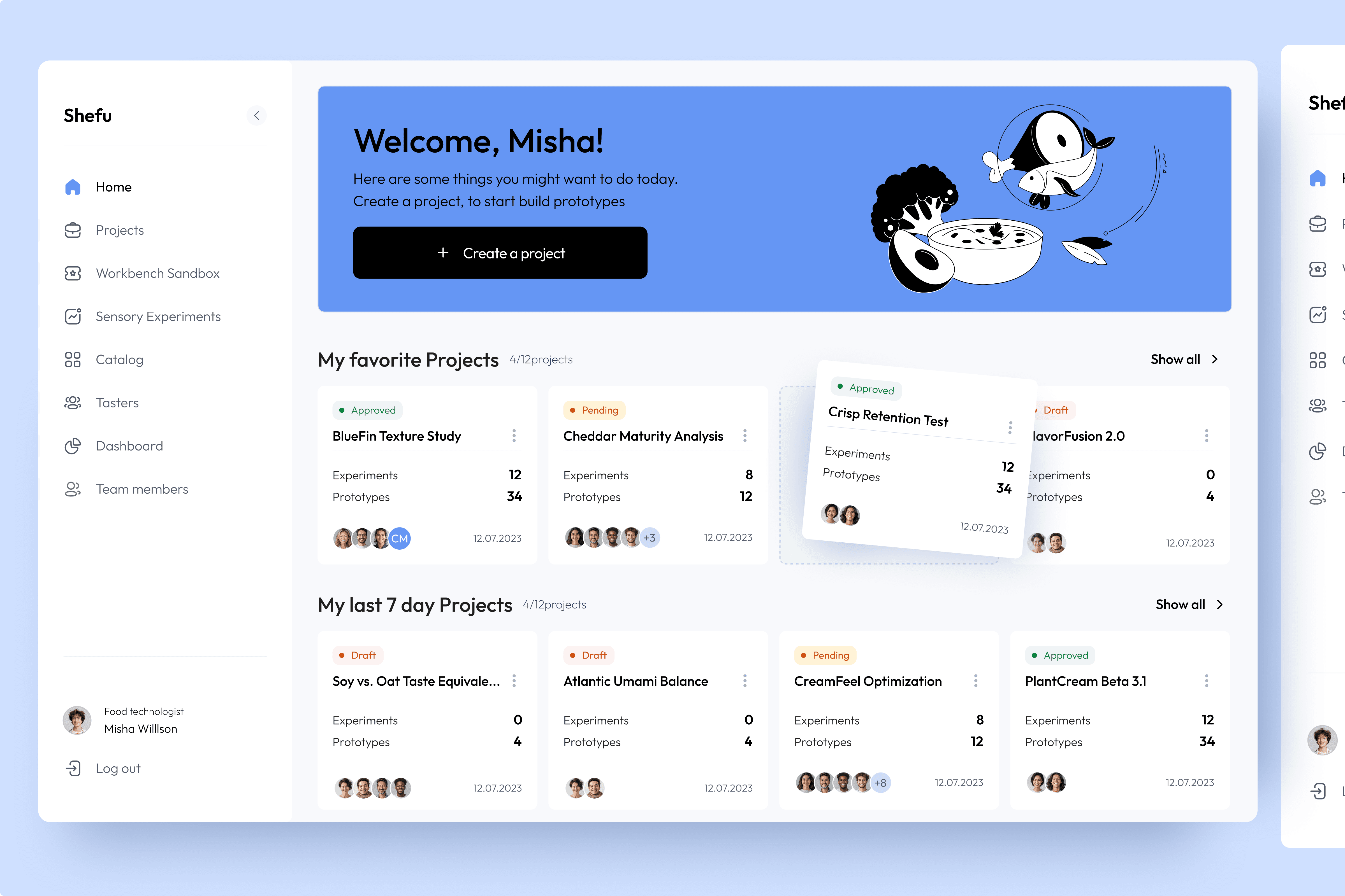
Concept 1 — Light Minimalism
A calm, minimal direction emphasizing clarity and content focus.
Key Traits:
Soft neutral surfaces
Light contrasts
Blue accent for hierarchy
Subtle shadows and generous spacing
Friendly graphic tone (fits tester audiences)
Goal:
Create an approachable interface where users can focus on key actions without visual noise.

Concept 2 — Structured Clarity
A high-contrast, data-dense design optimized for speed and readability.
Key Traits:
Strong contrast between tables/cards
Clear color-coded states
Dense information layout for experts
Sharper geometry & tighter spacing
More scientific / analytical tone
Goal:
Enhance quick scanning and detailed comparison for technologists and R&D roles

Final Summary
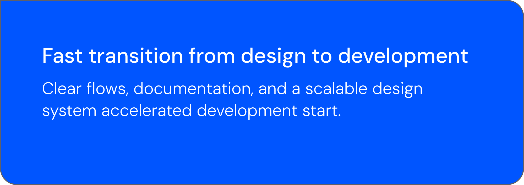
Across eight months, I led the end-to-end design of a unified FoodTech R&D platform — transforming fragmented workflows into a scalable, intelligence-driven system.
What I delivered:
Validated product strategy grounded in real user needs
Information architecture and streamlined cross-role workflows
Wireframes and interaction patterns designed for clarity and speed
Two visual concepts tested with stakeholders
Cohesive, production-ready UI across dashboard, mobile, and taster app
Modular design system to support long-term scalability
Impact:
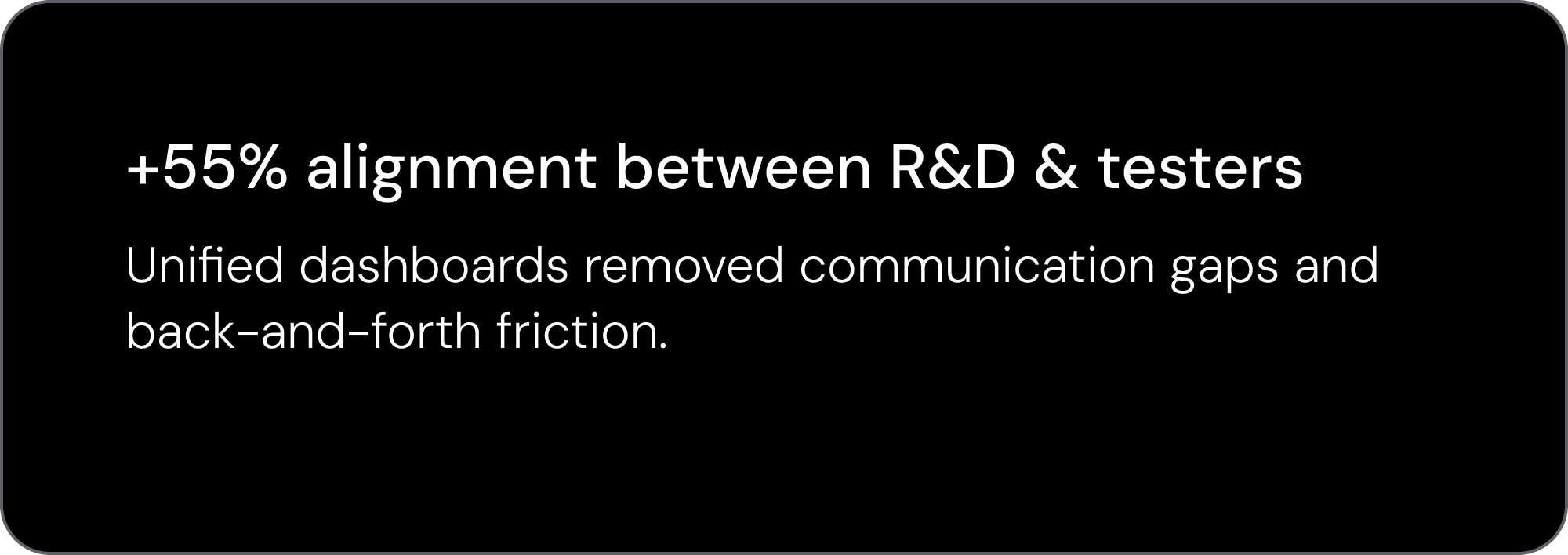
Faster experiment cycles (up to 55% improvement)
Reduced manual work and data inconsistencies
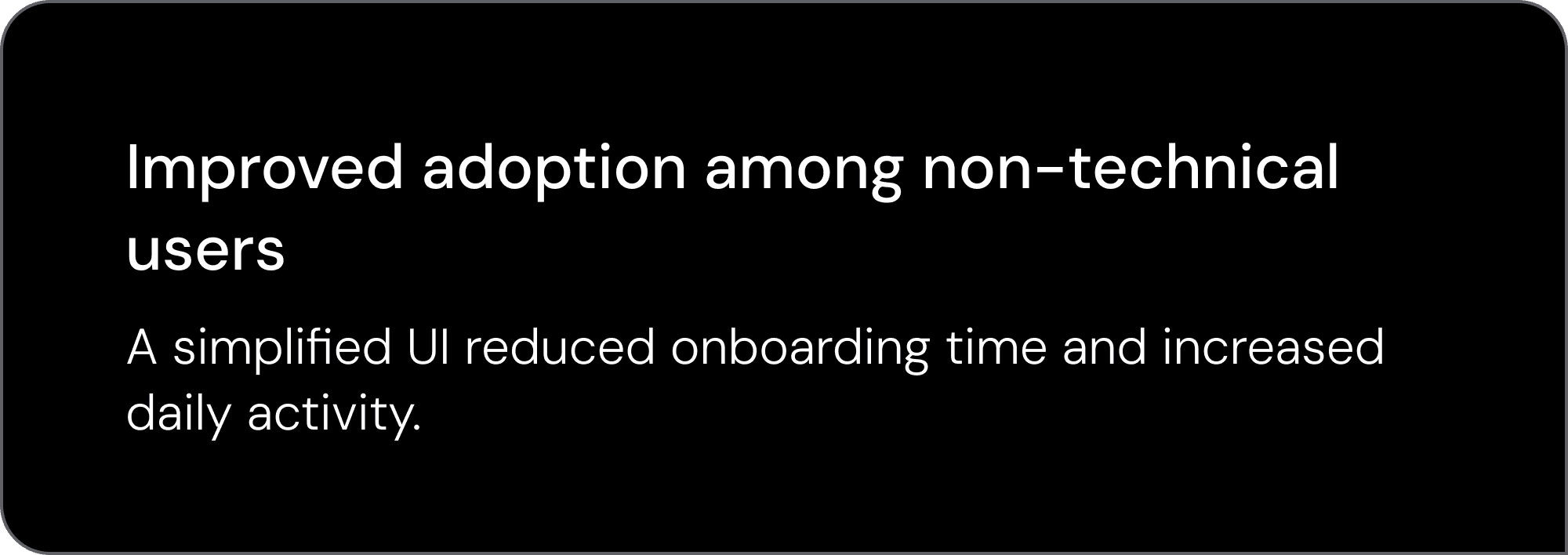
Higher usability for both experts and non-technical testers
Stronger cross-team alignment
Developer-ready product foundation for smooth implementation
Outcome:
A cohesive, scalable platform that aligns R&D teams, simplifies testing workflows, and supports future AI-driven innovation.


Results
This project delivered a scalable foundation for FoodTech innovation — enabling teams to work faster, more confidently, and more intelligently.